Last week, the STORM team drove through Turkmenistan – the only country in the tour with no KPN 3G connectivity. So there were a few days with no real-time data coming in. In order to still be able to follow the tour, we created some simple predictions based on latitude and longitude, Google traffic info, the planned route, and historical data on average speed.
Since there was also no real-time data coming in on start and stop of the stage drive, we had the STORM team send us a text message at departure and arrival. We then manually entered them into the analytics platform. Indeed, quite the sophisticated way of data transfer.
Due to the mostly-missing internet connection we also did not receive data from the motorcycle via the CAN bus (the messaging network used by all components of the motorcycle to exchange measurements, events and orders). We use this data to determine the battery’s state of charge, the voltages of the individual battery cells and the speed, among other things.
That is why this week’s data analysis focuses on the STORM data that we actually have – such as tweets and visits of the website to follow STORM.
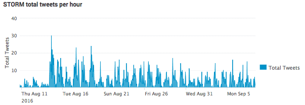
In the Itility data analysis methodology we start out with some simple visualizations of the data. The graph below shows that tweets (with the #Storm80days hashtag) are coming in at a positive rate of between 1 and 20 per hour, fewer during night time and more in the afternoon / evening.

The next step is to dive a little deeper in the data to understand what’s going on. Because STORM is an interesting project by young students, we expected the tweets to contain mostly positive messages. Sentiment analysis (based on both the English and Dutch sentiment word lists) on those tweets shows the pattern below– a constant positive and neutral flow, with a minuscule line of “negative”, proving our hypothesis and providing a base for further investigations.

Digging deeper into the tweets marked as “negative”, we found that most of those tweets where actually not very negative but they contained words like “missed” and “raining”. Tweets that are actually negative are tweets about a bad night of sleep (due to a gas leak and a bed breaking down).
Now that we knew a little more about the messages with the hashtag #Storm80Days, we wanted to know more about related hashtags. The hashtags that are used change on a daily basis. They are picked depending on where the STORM team is giving presentations or doing events. To gain more visibility of the used hashtags, we created a dynamic word cloud. The cloud is updated in real-time to show the hashtags used in combination with #Storm80Days. In the image below you can see that the location of the motorcycle is often used as hashtag. Coincidentally, STORM team member Maartje Verhoek was nominated for “TechGirl of the month” . During the last days of August, #techgirl was frequently used. In case you were wondering – she won! Congratulations Maartije for being TechGirl of the month of August!

The next step is to find correlations in the data. We tried to find correlations between words in tweets posted in the early days of the tour, showing quite obvious correlations.

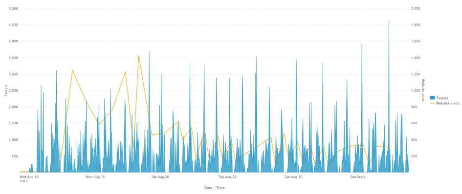
Because the correlation between words in tweets is not really interesting, due to very predictable results, we tried to find a correlation between website visits and tweets. We expected that the number of tweets is related to the number of website visits, because visitors would tweet about the website. In the picture below you can see that we were somewhat right:

There is a strong correlation in the center of the graph, between August 20 and September 1.
Keep following Storm via follow.storm-eindhoven.nl. We will post new updates and analysis results on a daily basis!
Like this article? Subscribe to our weekly newsletter to never miss out!


