Heatmaps are now becoming a popular visualization technology used outside the fence of data science. They can be used, for example, to produce an overlay on a webpage to let web site administrators easily understand which parts of the site are most interesting (application examples can be found at https://heatmap.me).
Generally, heatmap colors are arranged in a scale with shades from blue to red to represent concepts such as “low”, “medium” or “high”; however, by following this interpretation it is not possible to convey dynamic behaviors, e.g. whether temperatures in a given region are rising or not.
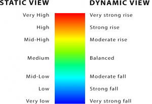
Our recently published Chartie API works in this direction. It allows to transform a signal (i.e. a numerical array) in trend words such as “strong rise” or “moderate fall” representing signal dynamics. Each color in the scale accounts for a specific trend value in the span from the very strong fall to the very strong rise behavior.
Hence, with particular reference to real-time data analytics applications, Chartie introduces a paradigm shift from a static value-oriented view towards a dynamic behavior-oriented view. Figure below compares the two stances.
With this perspective in mind, we can now re-interpret heatmap usage in a very dynamic way.
Data Source
Our showcase is a live example of the temperature trends in the Italian Trentino Region.
Temperature signals are collected from the open data of about 100 weather stations scattered throughout the region. Raw data are retrieved through a Web call like this:
where the URL parameter is the station code. Only temperature data were considered.
Data are provided on a daily basis and are returned in XML format with an entry every 15 minutes starting from the midnight.
[code language=”xml”]<temperature_aria UM=”°C”>
<data>2015-03-31T00:30:00</data>
<temperatura>11.2</temperatura>
</temperature_aria>[/code]
Employed Architecture
On the server side, a cron PHP job saves these entries in a MySQL table to update the temperature signal of each station with the upcoming values.
On the client side, an example dashboard has been setup to manage both visualization and processing.
At the visualization level, the open source gmaps-heatmap.js library that creates a heatmap layer for Google Maps has been used.
At the processing level, when a user submits a query to retrieve the whole regional trend behavior of a particular period of time, one HTTP POST AJAX call to the Chartie API is performed per each station with the data array returned by the user query.
Given the same time window, numerical arrays can be of different length since there can be missing entries in some stations, furthermore sampling time can vary from one station to another. Notwithstanding, thanks to Chartie, signal interpretation is not compromised since result (trend behavior) is brought at a semantic level.
[code language=”php”]$.ajax({
type:"POST",url:"http://api.chartie.io?"+"key=…Your key…&mode=basic",
data:JSON.stringify(temperatureSignalArray),
async:true, dataType:"json",timeout:1000,
success:
function(signal){
var strength=signal.strength;
var trend=signal.trend;
//logics here
}
});[/code]
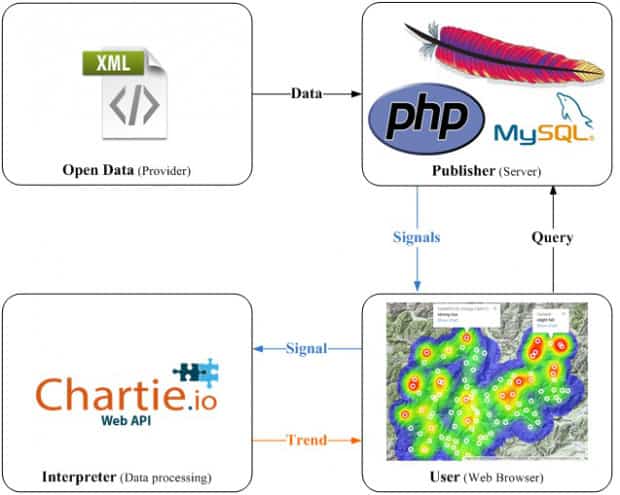
As soon as trend behaviors are returned, the heatmap starts filling in with colored spots according to the legend described previously. Reddish areas account for increasing temperature trends, blue areas indicate decreasing trends and green areas are characterized by a balanced behavior.
The overall architecture is depicted in the previous figure: each quadrant accounts for both a different stage and a different actor playing in the data flow. Browser scripting works as a broker between database and processing resources (Chartie API). This brokering activity results in a semantically-enhanced output for the end-user obtained through a reintepretation of the geo-referenced heatmap widget in terms of dynamic behavior. At the same time, the data processing layer is decoupled from the data publishing layer thus avoiding additional computational efforts on the server side.
Concluding remarks and Applications
In sum, by coupling geo-referenced heatmaps with Chartie API, it is possible to provide an easy-to-understand view of a complex dynamic behavior such as the temperature trends of a whole region.
A number of possible application contexts can be imagined, we cite just two of them for example.
In the scenario of smart cities: producing panel views to display real-time dynamic behaviors of many public utility variables such as:
- waste production
- air quality
- traffic flows
- house prices and so on.
By substituting the geo-referenced map with the playing field, dynamic heatmaps can be also used in sport settings, for example to identify the increasing or decreasing trend of events in football pitches during live matches.
 Marco Calabrese is a co-founder of Holsys Società Cooperativa– an Italian startup devoted to developing new generation AI applications. After several months of research, Marco and colleagues recently published Chartie, an API that transforms numerical array into trend words like “strong rise” to lessen the existing semantic gap between data and processing.


