Dataconomy
  • News
    • Artificial Intelligence
    • Cybersecurity
    • DeFi & Blockchain
    • Finance
    • Gaming
    • Startups
    • Tech
  • Industry
  • Research
  • Resources
    • Articles
    • Guides
    • Case Studies
    • Glossary
    • Whitepapers
  • Newsletter
  • + More
    • Conversations
    • Events
    • About
      • About
      • Contact
      • Imprint
      • Legal & Privacy
      • Partner With Us
Subscribe
No Result
View All Result
  • AI
  • Tech
  • Cybersecurity
  • Finance
  • DeFi & Blockchain
  • Startups
  • Gaming
Dataconomy
  • News
    • Artificial Intelligence
    • Cybersecurity
    • DeFi & Blockchain
    • Finance
    • Gaming
    • Startups
    • Tech
  • Industry
  • Research
  • Resources
    • Articles
    • Guides
    • Case Studies
    • Glossary
    • Whitepapers
  • Newsletter
  • + More
    • Conversations
    • Events
    • About
      • About
      • Contact
      • Imprint
      • Legal & Privacy
      • Partner With Us
Subscribe
No Result
View All Result
Dataconomy
No Result
View All Result

The World Cup, Visualised

byEileen McNulty
June 21, 2014
in infographics, News
Home Resources infographics
Share on FacebookShare on TwitterShare on LinkedInShare on WhatsAppShare on e-mail

If you’re not sick of World Cup fever just yet, we have a few World Cup visualisations to brighten up your weekend.

World Cup Visualised Squadds

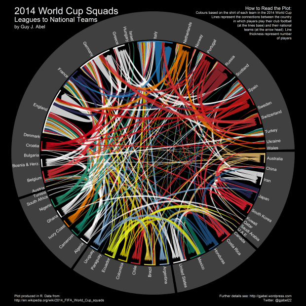
The first is a visualisation showing how World Cup teams are drawn from league players around the world. Although you have to be a national citizen to play for on a particular country’s team in the World Cup, you don’t have to be a citizen to play in their leagues. This visualisation by Guy Abel, a statistician and R programmer at the Vienna Institute of Demography, shows where members of the World Cup team usually play around the world. The arrows flow from the World Cup teams to the players’ regular league teams. Arrows folding back on themselves denote players who play in league teams from their own country (check out Russia and Italy, for example). The visualisation was created in R using the Circlize package and data scraped from Wikipedia; you can access the code for this plot on Github.

Stay Ahead of the Curve!

Don't miss out on the latest insights, trends, and analysis in the world of data, technology, and startups. Subscribe to our newsletter and get exclusive content delivered straight to your inbox.

The World Cup Visualised StadiumsThe second is a much less data-heavy visual history of the final stadiums of the World Cup (click here to enlarge). Grass Form, the creators of this infographic, had this to say:

Of course part of the World Cup legend are the iconic stadia; from the timeless twin towers of Wembley to the newly-revamped Maracanã which will take pride of place at this year’s tournament, these coliseums have provided the platforms for the most iconic moments in the history of the game.

Interestingly, the infographic shows the capacity of each stadium too. The Estadio Do Maracana, the home of the World Cup this year, hosts 96,000 people; compare that to Stade de Olympique de Colombes, home of the 1938 World Cup which seated a paltry 14,000 people.

If this article hasn’t sated your appetite for all things World Cup, you should check out our posts on using data to predict the World Cup winner, and how the German team are using big data to gain the competitive edge.

(Sources: Cool Infographics, Revolution Analytics)
Tags: footballinfographicsRVisualisationsworld cup

Related Posts

Amazon claims its new AI video summaries have “theatrical quality”

Amazon claims its new AI video summaries have “theatrical quality”

November 20, 2025
Google finally copies the best feature from Edge and Vivaldi

Google finally copies the best feature from Edge and Vivaldi

November 20, 2025
Perplexity launches free agentic shopping tool with PayPal

Perplexity launches free agentic shopping tool with PayPal

November 20, 2025
You should keep your Snapdragon 8 Gen 3 if you want to run emulators

You should keep your Snapdragon 8 Gen 3 if you want to run emulators

November 20, 2025
Netflix grabs the Home Run Derby in fifty million dollar baseball deal

Netflix grabs the Home Run Derby in fifty million dollar baseball deal

November 20, 2025
OpenAI says its new coding model can work for 24 hours straight

OpenAI says its new coding model can work for 24 hours straight

November 20, 2025
Please login to join discussion

LATEST NEWS

Amazon claims its new AI video summaries have “theatrical quality”

Google finally copies the best feature from Edge and Vivaldi

Perplexity launches free agentic shopping tool with PayPal

You should keep your Snapdragon 8 Gen 3 if you want to run emulators

Netflix grabs the Home Run Derby in fifty million dollar baseball deal

OpenAI says its new coding model can work for 24 hours straight

Dataconomy

COPYRIGHT © DATACONOMY MEDIA GMBH, ALL RIGHTS RESERVED.

  • About
  • Imprint
  • Contact
  • Legal & Privacy

Follow Us

  • News
    • Artificial Intelligence
    • Cybersecurity
    • DeFi & Blockchain
    • Finance
    • Gaming
    • Startups
    • Tech
  • Industry
  • Research
  • Resources
    • Articles
    • Guides
    • Case Studies
    • Glossary
    • Whitepapers
  • Newsletter
  • + More
    • Conversations
    • Events
    • About
      • About
      • Contact
      • Imprint
      • Legal & Privacy
      • Partner With Us
No Result
View All Result
Subscribe

This website uses cookies. By continuing to use this website you are giving consent to cookies being used. Visit our Privacy Policy.