RJMetrics posted an article earlier this month on their blog revealing some interesting data that has emerged from Pinterest over the past 4 four years. RJMetrics analysed a dataset of 50,000 Pinterest users and their activities to understand user engagement, what users are viewing, and what this data would mean for the future of Pinterest.
For those who do not know the jargon associated with Pinterest, a good way to understand it is by comparing it to Facebook. Where Facebook has a system that allows users to “like” a photo, page or comment, Pinterest allows its viewership to “pin” a picture. What lies behind “pinning”, as RJMetrics note, is the idea that the picture is something the user wants, and therefore pins; it is “aspirational.” Because the nature of “pinning is aspirational…data on pins is data on people’s aspirations.”
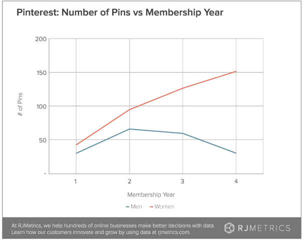
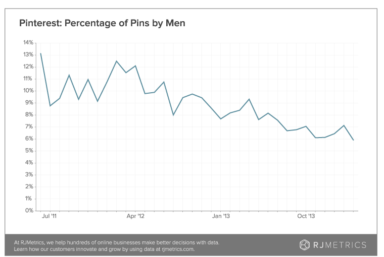
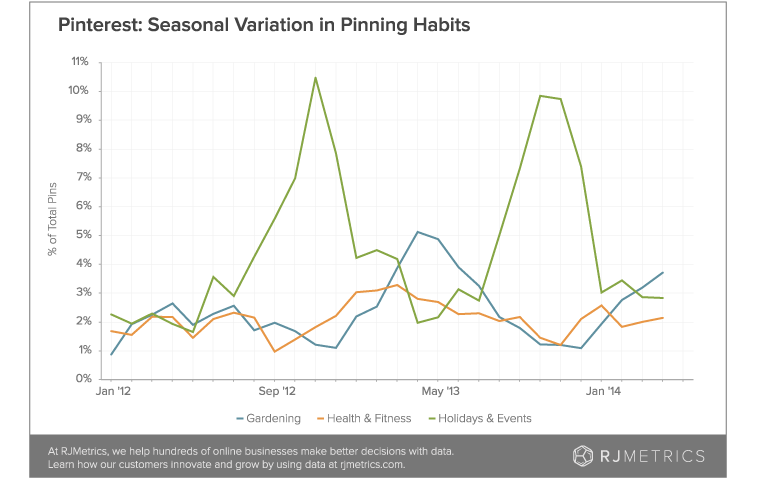
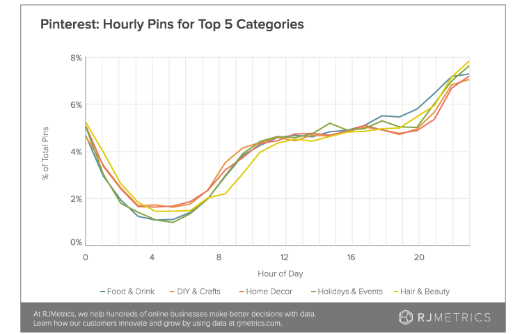
Below are some graphs of the most “pinned” brands on Pinterest, data on gender and Pinterest usage, and the categories most popular on the website.
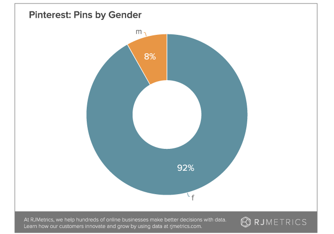
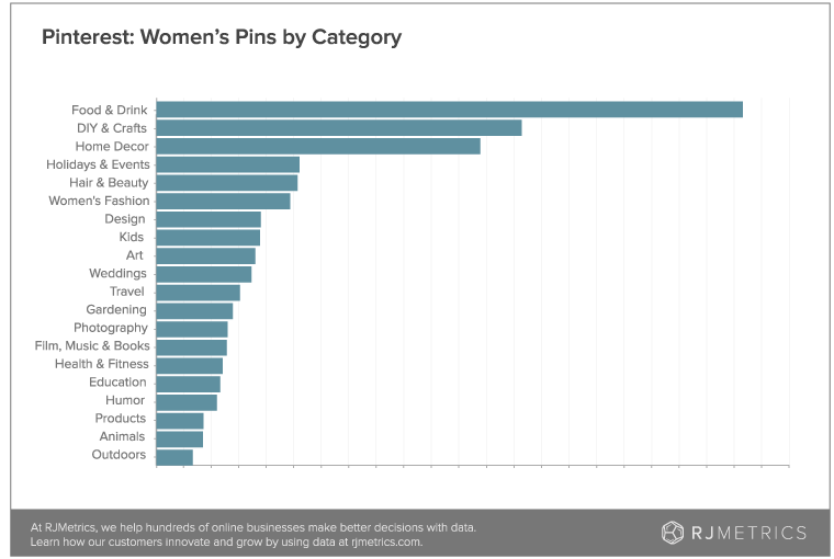
As RJMetric note, this graph may not be the most compelling pieces of data, but when considered together with the graph below, there are some interesting things to note.
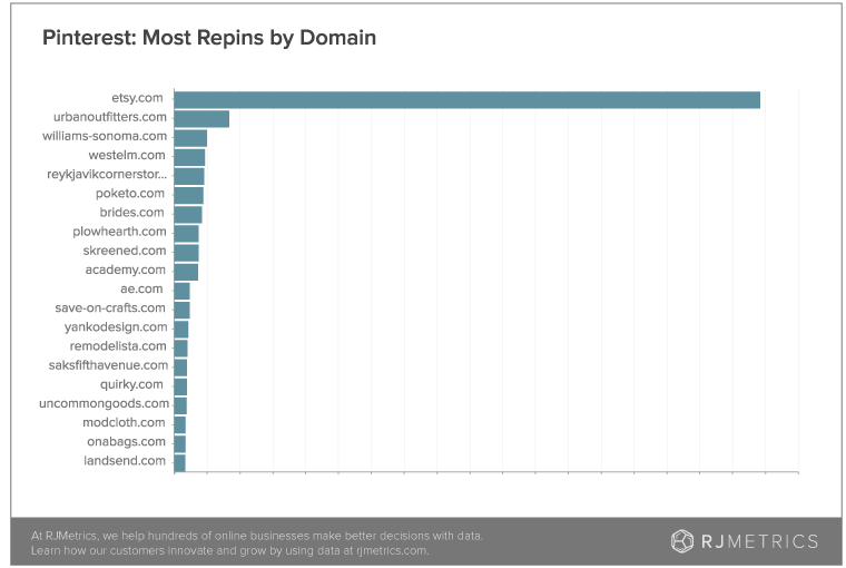
A possible explanation for Etsy’s dominance in this graph is that its product offerings are completely in line with the “aspirations of Pinterest users.” If one looks at the most popular categories in the first graph (Food and Drink, DIY and Crafts, Home Decor), it is not difficult to understand why Etsy is doing so well — it offers products in all three categories and markets them on a site that has users particularly interested those categories.
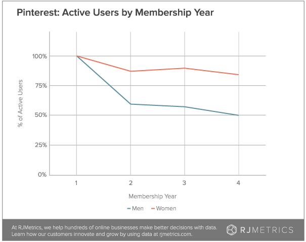
Here are some more graphs from RJ Metrics:
(Image Credit: StartBloggingOnline.com, CC2.0)


