The sudden emergence of the new ChatGPT design has injected a breath of fresh air into the realm of OpenAI’s AI chatbot. Users engaging with ChatGPT are now greeted by a visually striking transformation that seamlessly fuses functionality with a futuristic touch.
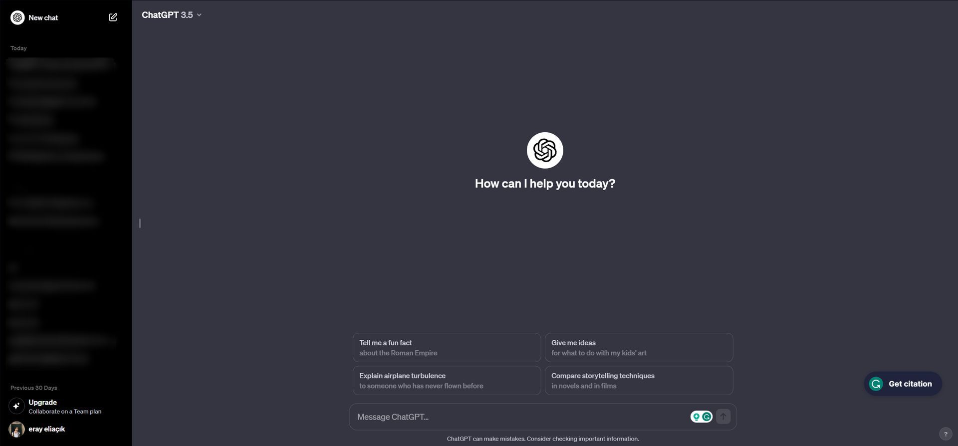
After the ChatGPT design change, the interface welcomes users with a clean and minimalist look. The updated aesthetic now exudes a Twitter-like vibe, characterized by the distinct ChatGPT grey, adding a touch of familiarity to the user experience. This visual cohesion serves to create an inviting environment for users, making their interactions not only efficient but also aesthetically pleasing. However, there are some changes you probably need to know.

First look at the new ChatGPT design
One of the most noticeable changes is the transformation of the left bar, now adorned in a chic black color. This deliberate choice in the color palette contributes to a more immersive experience. The soothing tones chosen by OpenAI reflect a thoughtful consideration for user comfort, fostering an environment where engagement with the chatbot becomes a delightful experience.
However, beneath the surface of this visual makeover, the core functionality of ChatGPT remains unaltered. Navigating through past conversations or initiating a new chat still follows the same familiar pathways, preserving the essence that users have grown accustomed to over time. This subtle balance between innovation and familiarity is a testament to OpenAI’s commitment to user satisfaction.

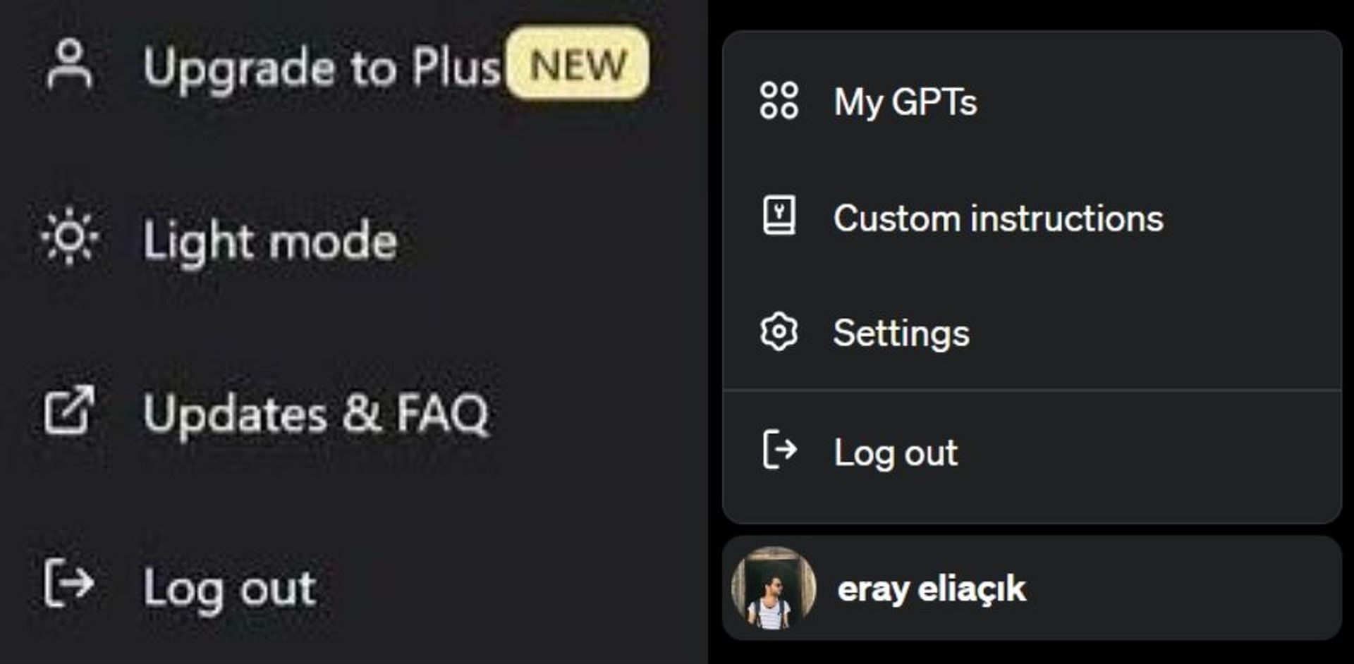
Not only has the chat button received a dazzling makeover, but the menu has also decided to elevate its style game, making a grand entrance in a sophisticated black-tie ensemble. And it is not always open now!
Here is a side-to-side comparison of the menu with the new ChaGPT design.

Where is the ChatGPT edit button?
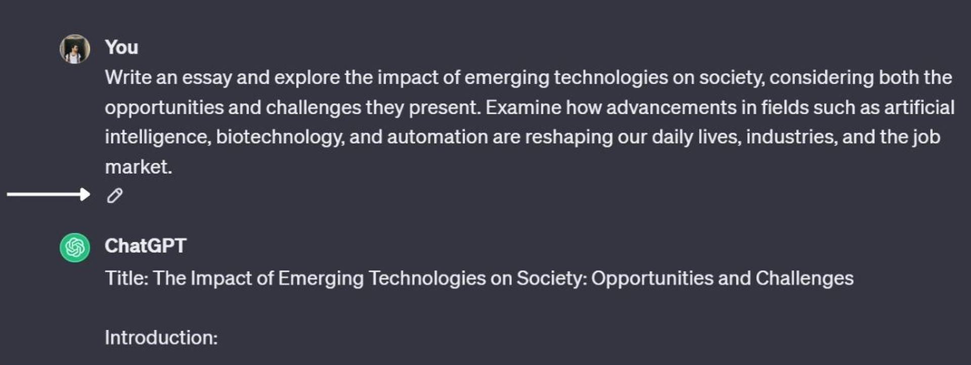
Delving into the details of the design adjustments, one notable change is the relocation of the edit button. In the previous iteration, users grappling with extensive text would find the edit button positioned at the top right corner. In the redesigned interface, the edit button has intelligently migrated to the conclusion of the prompt. This strategic shift not only enhances aesthetic symmetry but also aligns with a more intuitive and user-friendly experience. Users dealing with extended text inputs now find the editing process seamlessly logical, thanks to this thoughtful placement.
The decision to roll out a new ChatGPT design is not arbitrary; rather, it reflects a strategic move by OpenAI to elevate the user experience. By incorporating user feedback, OpenAI demonstrates a commitment to addressing usability concerns and design preferences. This redesign is not just a cosmetic change; it serves as a multifaceted approach to bolstering marketing and branding efforts. The aim is not only to enhance the visual appeal of ChatGPT but also to rekindle interest and trust in the chatbot.

OpenAI’s comprehensive strategy, as reflected in the new design, underscores the organization’s dedication to improving ChatGPT’s functionality, user attractiveness, and competitive standing in the dynamic landscape of artificial intelligence. The redesign also doubles as a means of bolstering marketing and branding efforts, and renewed interest and trust in ChatGPT.
New ChatGPT design recap
In conclusion, the unveiling of the new ChatGPT design marks a significant milestone in OpenAI’s commitment to user satisfaction and innovation. The sleek and minimalist interface, coupled with a thoughtful color palette, creates an inviting environment for users. Despite the visual overhaul, the core functionality remains unchanged, preserving the familiarity users appreciate. The strategic relocation of the edit button demonstrates a nuanced understanding of user needs, enhancing both aesthetics and usability.
OpenAI’s decision to revamp ChatGPT’s design is a deliberate and strategic move, reflecting a dedication to addressing user feedback and staying competitive in the ever-evolving landscape of artificial intelligence. This redesign is not merely cosmetic; it represents a multifaceted approach to improving functionality, user experience, and the overall market presence of ChatGPT.
Just today Sam Altman confirmed GPT-5, so the new ChatGPT design could be a signal of something too? We have to wait to see it for now.


