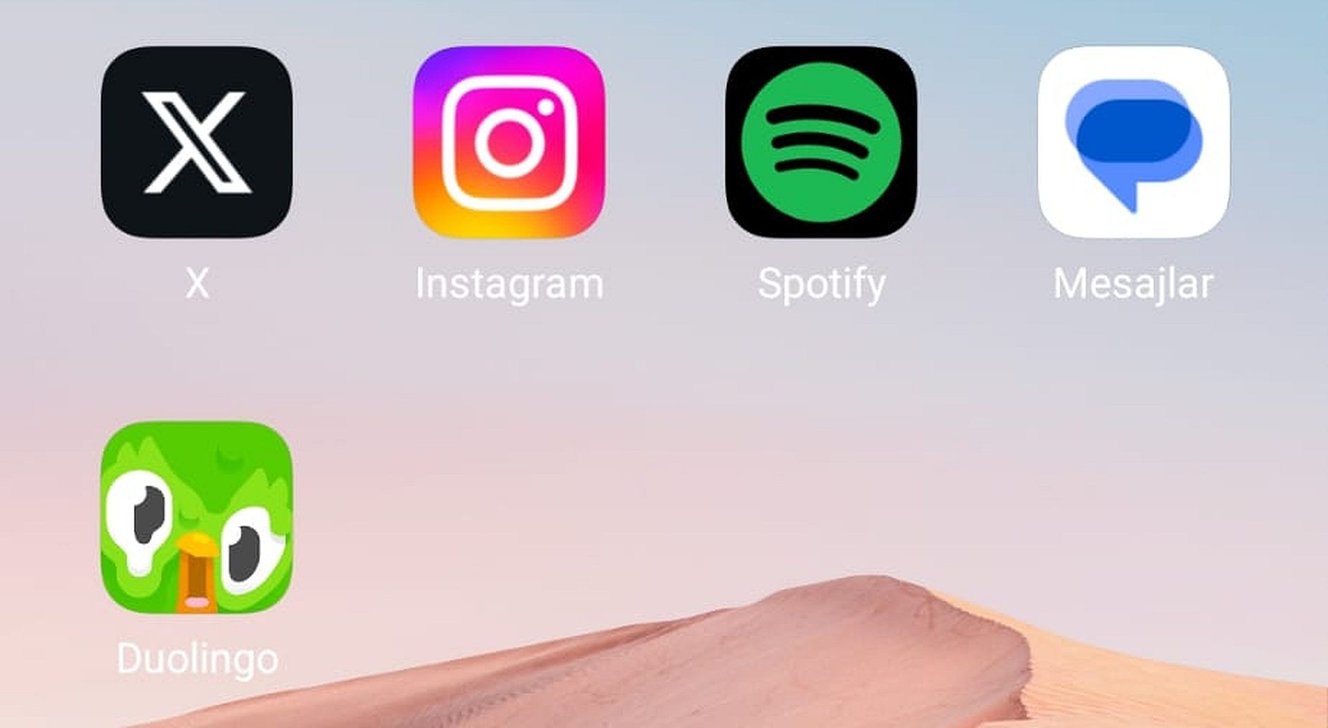
Did you see the new melting Duolingo app icon? In the world of language learning, few apps have managed to captivate our hearts and minds quite like Duolingo. It’s the trusty companion we turn to when we want to extend our streak, conquer new language challenges, and, let’s be honest, flex our linguistic muscles to climb the leaderboard. Yet, if you’re a devoted Duolingo user, you might have experienced quite a surprise on your smartphone one morning. Instead of the usual, friendly face of Duo the owl, you were met with a rather perplexing sight: a melting Duolingo app icon.
Yes, you saw that right – our beloved language-learning app’s iconic mascot seemed to be in the throes of a whimsical meltdown. It’s a sight that’s as bizarre as it is intriguing, and it has left countless users wondering, “Why is Duolingo melting?” Fear not; we’ve got the scoop on this peculiar transformation and how to change it.

Explained: The melting Duolingo app icon
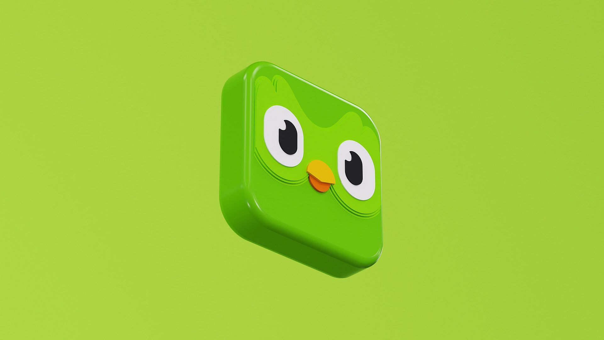
The melting Duolingo app icon is, without a doubt, a departure from the app’s traditional and well-recognized design. Instead of the usual friendly and upright Duo the owl, the icon showcases a charmingly quirky and somewhat whimsical transformation.
- Drooping eyes and beak: The most noticeable feature of the melting Duolingo app icon is Duo’s eyes and beak, both of which appear to be “melting” or drooping. It’s as though Duo, typically wide-eyed and alert, has suddenly become a bit drowsy or, dare we say, melted. These drooping features lend the icon a sense of playfulness and charm, making it stand out on your smartphone screen.
- Playful and whimsical aesthetic: This transformation retains Duolingo’s colorful aesthetic but adds a playful and whimsical twist. The app’s usual bright and cheerful color palette remains intact, and the background is still a shade of friendly green. However, the melting Duo introduces an element of surprise and creativity, perfectly encapsulating Duolingo’s approach to language learning: it should be fun and engaging.
- Purposeful quirkiness: Contrary to what some users might initially think, the melting Duolingo app icon is not the result of a technical glitch or an error in the app’s design. It’s a deliberate and temporary change introduced by Duolingo to encourage user engagement. The quirky and eye-catching icon is a unique and playful way to prompt users to open the app and continue their language-learning journey.
“The melting Duo you see is a new app icon that learners will see for a limited time. If learners have the latest version of the Duolingo app downloaded, they should see Melting Duo as the app icon. The purpose of the new app icon is to encourage learners to open the app.”
-A Duolingo spokesperson to Distractify
- Temporary feature: Importantly, this melting Duolingo icon is not a permanent change. It’s a limited-time feature, which will eventually revert to the standard Duolingo icon. So, users can enjoy this lighthearted transformation for a while, knowing that it won’t last forever.
The melting Duolingo app icon is a testament to Duolingo’s commitment to making language learning fun and engaging. It adds a touch of whimsy to the daily routine of language learners and exemplifies the app’s innovative approach to keeping users motivated and entertained. So, the next time you see Duo appear a bit “melted” on your screen, remember that it’s all in good fun and designed to keep you returning for more language adventures.
Users love the melting Duolingo app icon-like changes: After all, it pushed you to research, right?
Changes like the melting Duolingo app icon can attract and engage users in several ways. Let’s delve into how these kinds of alterations can captivate and retain a user’s attention, using the melting Duolingo app icon as an example:
- Novelty and surprise: When users encounter a sudden and unexpected change, like the melting Duolingo app icon, it sparks curiosity. It’s human nature to be drawn to new and surprising elements. Users, even long-time ones, will be intrigued by the novel experience and want to explore it further. The unexpected transformation creates a buzz and generates user conversations, driving engagement.

- Playfulness and fun: The melting Duolingo app icon adds a touch of playfulness and whimsy to the learning process. It demonstrates that language learning doesn’t have to be serious or daunting; it can be enjoyable and entertaining. Users are more likely to engage with a platform that makes them smile and brings joy to their daily routine.
- Interactive experience: Changes like this encourage users to interact with the app. Users are given a sense of agency and personalization by offering options to customize the icon. They become active participants in shaping their learning experience, making them feel more connected to the platform.
- Community engagement: Transforming the Duolingo icon into a melting version creates a shared experience among users. They discuss it, share their preferences, and even engage in a friendly competition to see who can create the most creative or unique icon. This communal interaction strengthens the sense of belonging to a community of language learners.
- Retaining user interest: Duolingo ensures that users will stay engaged and keep returning to the app by making the change temporary. Users know that this unique feature won’t last forever, so they are motivated to enjoy it while it lasts and to continue using the app to see what other surprises or features might be in store.
- Encouraging exploration: The change prompts users to explore the app and discover its different features. When initially drawn in by the melting icon, they may delve deeper into the app’s content, explore lessons, engage in challenges, and take advantage of its full range of language-learning resources.
In the case of the melting Duolingo app icon, the change is fun and smart. It’s a simple yet effective strategy to keep users engaged and motivated in their language-learning journey. By offering a quirky and temporary alteration, Duolingo demonstrates that it understands its users and is committed to making the learning process as engaging and enjoyable as possible. In turn, this approach fosters user loyalty and contributes to the app’s overall success.
Not everyone has to like this: How to change the melting Duolingo app icon
Changing the melting Duolingo app icon to something you like is a straightforward process. However, before you proceed, make sure that you have the latest version of the Duolingo app downloaded on your smartphone. App updates often include new features and options, so having the most recent version to access the icon-changing feature is essential.

Here’s a step-by-step guide on how to change the melting Duolingo app icon:
- For Super Duolingo or Duoling Max subscribers:
- Open the Duolingo app on your smartphone.
- Navigate to the Duolingo app’s home screen.
- Look for the Duo icon, typically at the screen’s top right. It may appear as a little owl head.
- Tap on the Duo icon.
- A menu with various options should appear. Scroll down to find “Super App Icon” or “Max App Icon,” depending on your subscription.
- Tap “Turn On” next to your preferred option (Super or Max-themed icon).
- The melting Duolingo app icon will replace the Super or Max-themed one you selected.
- For Streak Society members:
- Open the Duolingo app on your smartphone.
- Go to the Duolingo app’s home screen.
- Locate the fire or streak icon, typically near your screen’s top. This icon represents your streak and engagement with the app.
- Tap on the streak icon.
- Scroll down to find the “Streak Society” section.
- Choose “Change App Icon.”
- Select your preferred app icon from the options available.
- Restoring the melting Duolingo app icon:
- If you decide to bring back the melting Duolingo app icon after changing it, you can easily do so.
- Repeat the steps above to access the app icon settings.
- Select “Restore Original Icon” or a similar option, depending on the screen’s wording.
- The melting Duolingo app icon will return to your home screen.
Remember that these changes are not permanent, and you can switch between different icons whenever you like, provided you have the appropriate subscription or engagement status (for Streak Society members). This feature adds a touch of personalization to your Duolingo experience, allowing you to showcase your language learning style with an icon that suits you best.
Do you want more stories about Duolingo? Check out the Duolingo data breach that affects 2.6 million users.


