Dataconomy
  • News
    • Artificial Intelligence
    • Cybersecurity
    • DeFi & Blockchain
    • Finance
    • Gaming
    • Startups
    • Tech
  • Industry
  • Research
  • Resources
    • Articles
    • Guides
    • Case Studies
    • Glossary
    • Whitepapers
  • Newsletter
  • + More
    • Conversations
    • Events
    • About
      • About
      • Contact
      • Imprint
      • Legal & Privacy
      • Partner With Us
Subscribe
No Result
View All Result
  • AI
  • Tech
  • Cybersecurity
  • Finance
  • DeFi & Blockchain
  • Startups
  • Gaming
Dataconomy
  • News
    • Artificial Intelligence
    • Cybersecurity
    • DeFi & Blockchain
    • Finance
    • Gaming
    • Startups
    • Tech
  • Industry
  • Research
  • Resources
    • Articles
    • Guides
    • Case Studies
    • Glossary
    • Whitepapers
  • Newsletter
  • + More
    • Conversations
    • Events
    • About
      • About
      • Contact
      • Imprint
      • Legal & Privacy
      • Partner With Us
Subscribe
No Result
View All Result
Dataconomy
No Result
View All Result

3 Incredible Big Data Heat Maps

byadmin
April 18, 2014
in Trends

Visualising big data can often be a handy tool for upper level management. In a matter of seconds, you can see flu trends, popular areas in a city, internet outages, web fraud, what is popular in your shop, and much more. Handling huge amounts of data is usually restricted to a specialised few, but with heat maps, data becomes accessible to everyone. We have compiled a list of 3 heat maps that simplify massive data sets into neat visualisations.

1) Foursquare

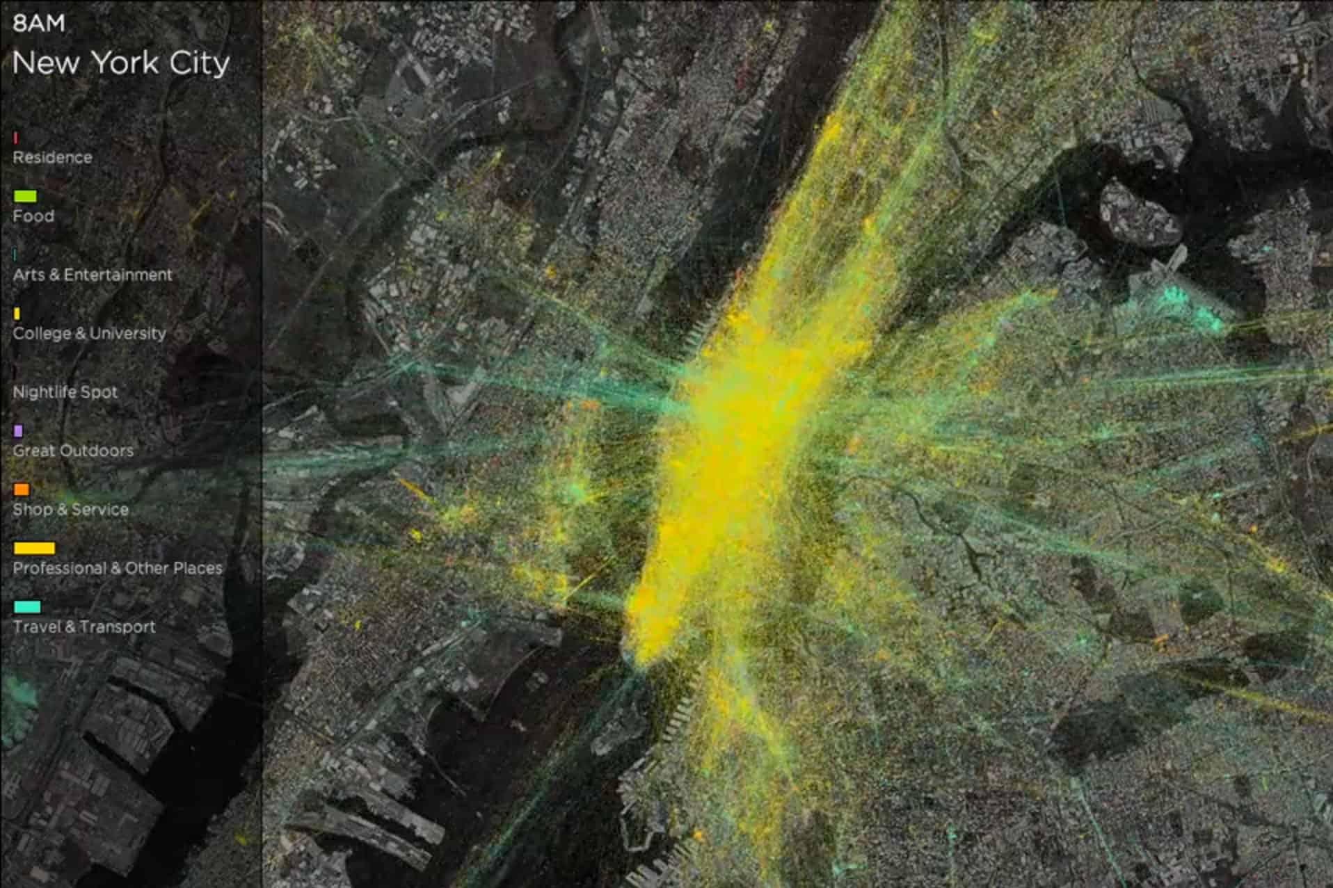
One of the most insightful collections of heat maps comes from Foursquare’s database of check-ins. Foursquare released heat map videos of 6 cities — New York, London, Istanbul, Tokyo, San Francisco and Chicago — where people can view the most popular destinations, travel times, and general movements of the population. This data is a handy tool for city planners to make informed decisions about where to direct their services.

You can view the collection here

Stay Ahead of the Curve!

Don't miss out on the latest insights, trends, and analysis in the world of data, technology, and startups. Subscribe to our newsletter and get exclusive content delivered straight to your inbox.

26-foursquare-map

2) ThreatMatrix

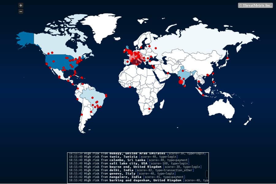
ThreatMatrix shows the location, and risk, of web-fraud across the globe. The heat map is in real time and provides a fascinating insight into the countries, regions and cities that are currently facing web fraud. ThreatMatrix uses data from 1,950 customers, including 9,000 websites and tracks approximately 360,000 cyberattacks a day. “Customers can use the data to correlate the high-number of attacks with their threat detection and blocking.”

You can view ThreatMatrix in realtime here

Screen Shot 2014-04-17 at 18.55.35

3) RetailNext

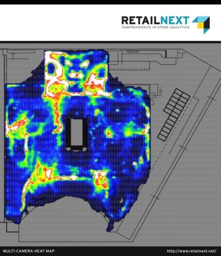
RetailNext is a fascinating example of “offline” analytics. The company offers a visualisation of customer behaviour in retail stores. The areas that are red represent the places where customers spend the most time. Through this information, retail stores can understand what product placements are working, see whether a sales campaign was successful, and even gauge whether the store should be re-organised.

retailnext-floor-heatmap-med-431x500

You can view the RetailNext website here

(Image Credit: Trendsmap)
Tags: Big DataCIOpredictive analytics

Related Posts

accessiBe review: How the company helps businesses build more accessible digital experiences

accessiBe review: How the company helps businesses build more accessible digital experiences

July 14, 2025
The creator economy is dead. Welcome to the learner economy

The creator economy is dead. Welcome to the learner economy

July 3, 2025
How a crypto wallet keeps digital coins safe: All you need to know

How a crypto wallet keeps digital coins safe: All you need to know

July 3, 2025
Implementing identity first security for stronger access control

Implementing identity first security for stronger access control

April 15, 2025
Switch 2 vs Switch Lite: Is the upgrade worth it?

Switch 2 vs Switch Lite: Is the upgrade worth it?

April 9, 2025
What is airport theory: A TikTok trend that pushes travel limits

What is airport theory: A TikTok trend that pushes travel limits

March 18, 2025
Please login to join discussion

LATEST NEWS

AT&T launches nationwide 5G Standalone network

EU announces its new AI plan with a €1B budget

Google just accidentally revealed a new Docs AI feature for Android

Sora’s invite-only launch was almost as big as ChatGPT’s public one

That ultra-rugged Nokia phone is reportedly making a modern comeback

New WhatsApp interface is appearing for a select few on iOS

Dataconomy

COPYRIGHT © DATACONOMY MEDIA GMBH, ALL RIGHTS RESERVED.

  • About
  • Imprint
  • Contact
  • Legal & Privacy

Follow Us

  • News
    • Artificial Intelligence
    • Cybersecurity
    • DeFi & Blockchain
    • Finance
    • Gaming
    • Startups
    • Tech
  • Industry
  • Research
  • Resources
    • Articles
    • Guides
    • Case Studies
    • Glossary
    • Whitepapers
  • Newsletter
  • + More
    • Conversations
    • Events
    • About
      • About
      • Contact
      • Imprint
      • Legal & Privacy
      • Partner With Us
No Result
View All Result
Subscribe

This website uses cookies. By continuing to use this website you are giving consent to cookies being used. Visit our Privacy Policy.